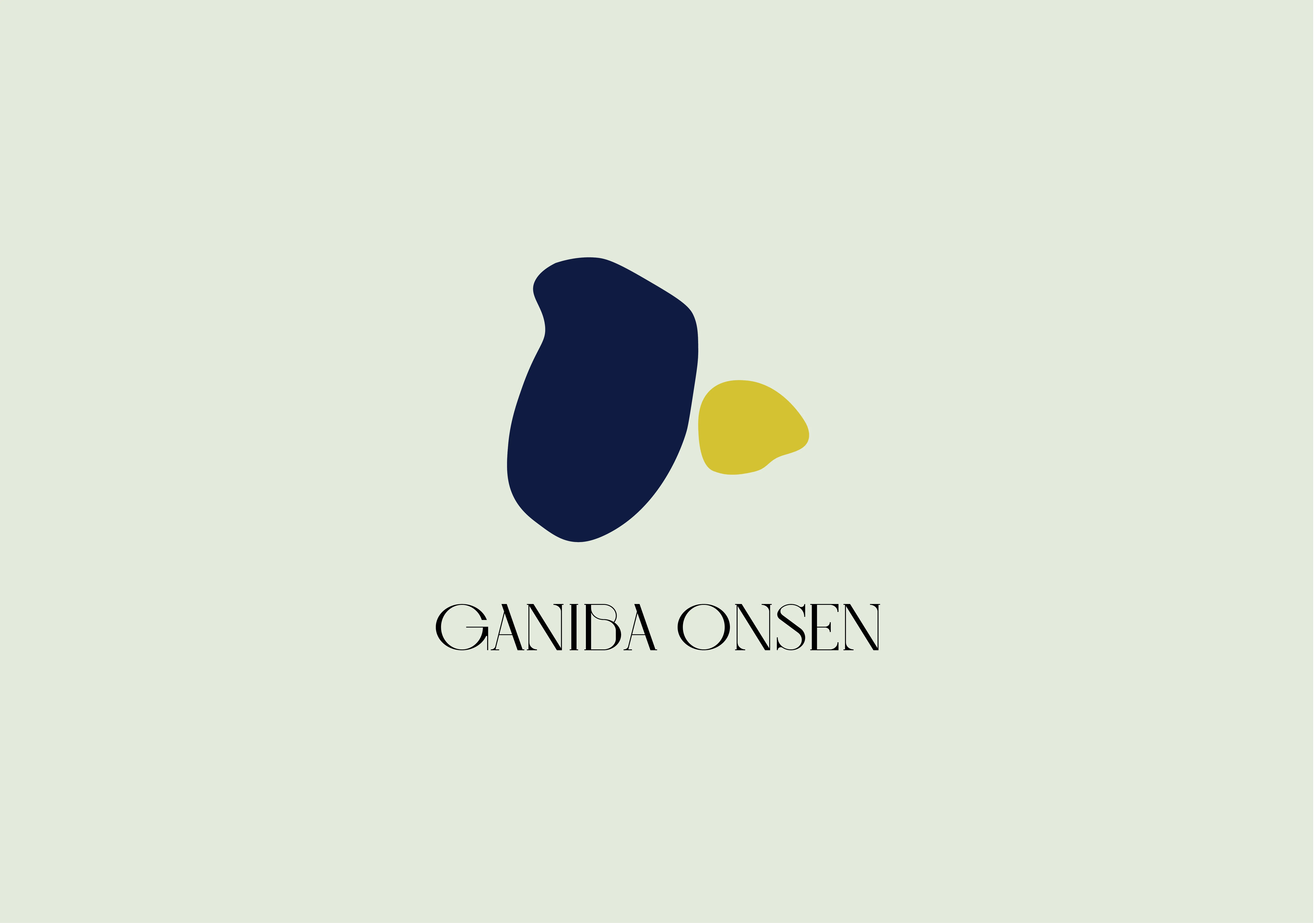
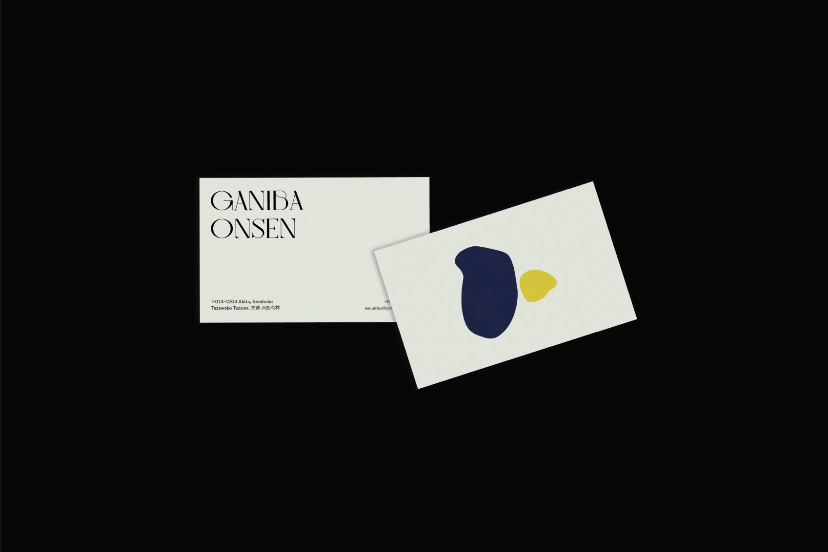
The logo was created as an abstract representation of the feature onsen, with the traditional kimono blue to represent the openness of the onsen to all and gold as the hut to symbolise the special, divine colour of the sun and the heavens.
To me, the onsen felt like a middle-aged businessman, but with a hint of playfulness deep down in his heart.
IDENTITY
1a
Marketing Material
1b
Logo
1c
Business Card
TYPOGRAPHY
Whilst finalising a suitable type system, I wanted to combine this playfulness of the onsen but keep it rooted in its outstanding efficiency and hospitality. The type system consists of Bigilla, an attention-grabbing yet elegant serif typeface, and Reason New - a highly legible sans serif typeface for conveying the details.
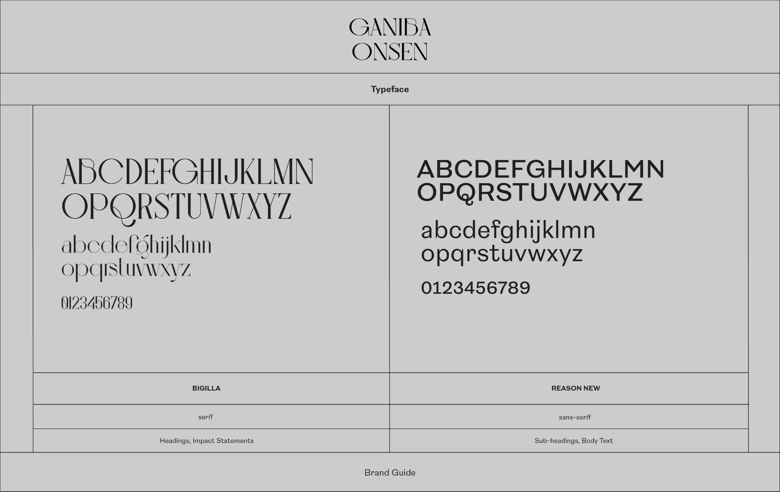
2a
Typeface System
ILLUSTRATION STYLE
I developed a playful illustration style to pair with the type system, using a graphite pencil to create various scenarios you might encounter during your stay at the onsen. These posters utitlise pastel colours to promote the onsen's youthful yet bold perspective on housekeeping.
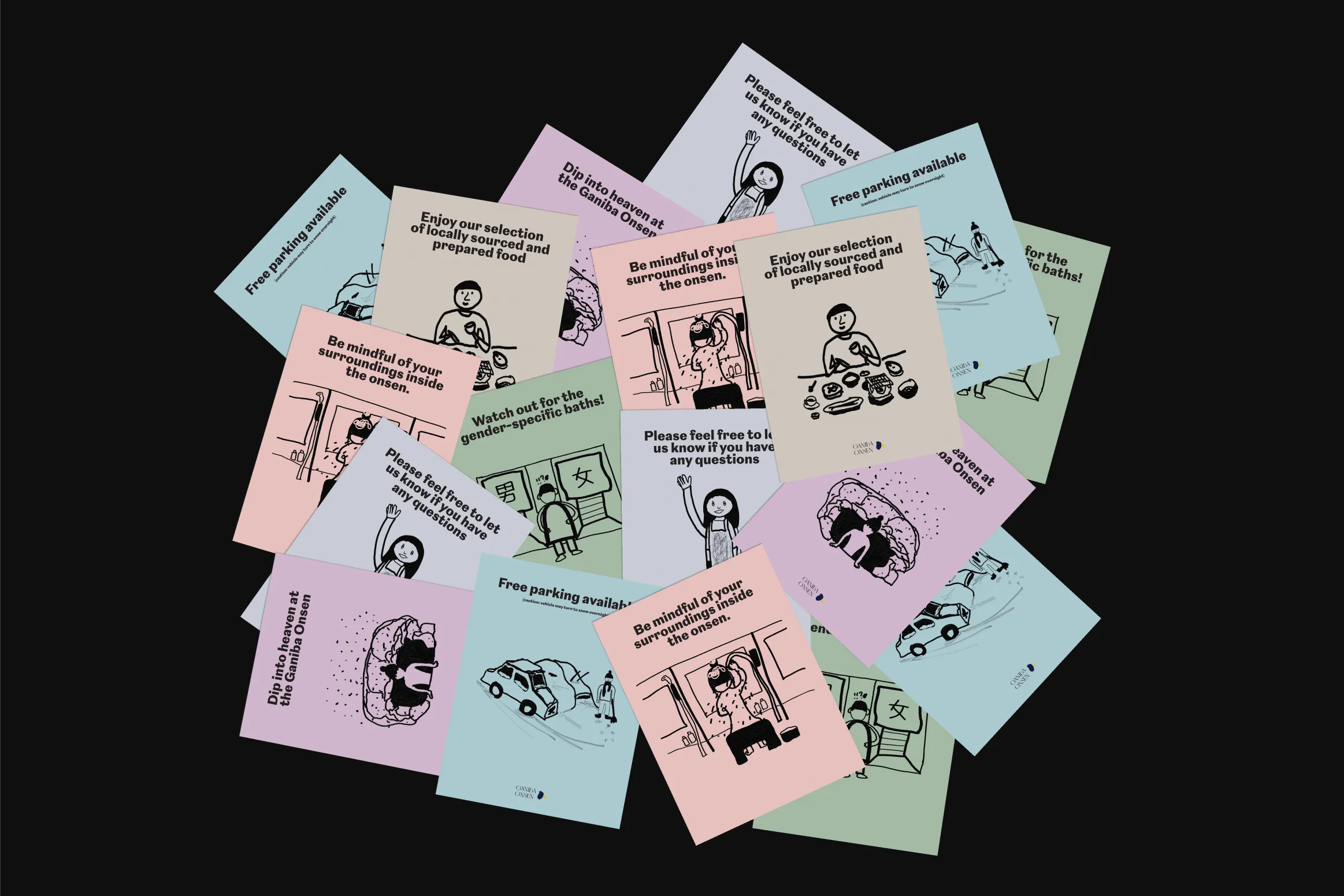
3a
Illustration Guides
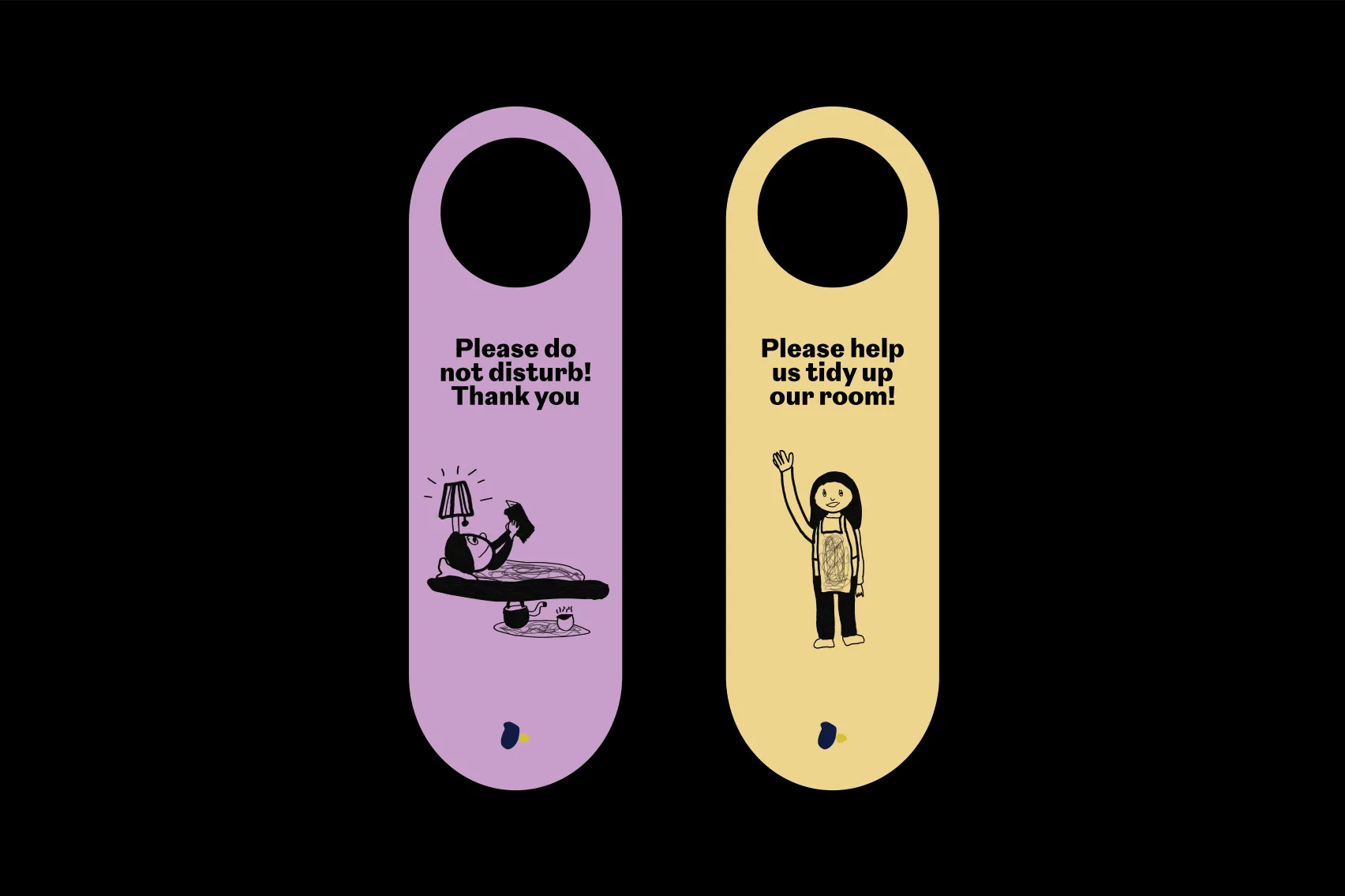
3b
Room Cards
PHOTOGRAPHY
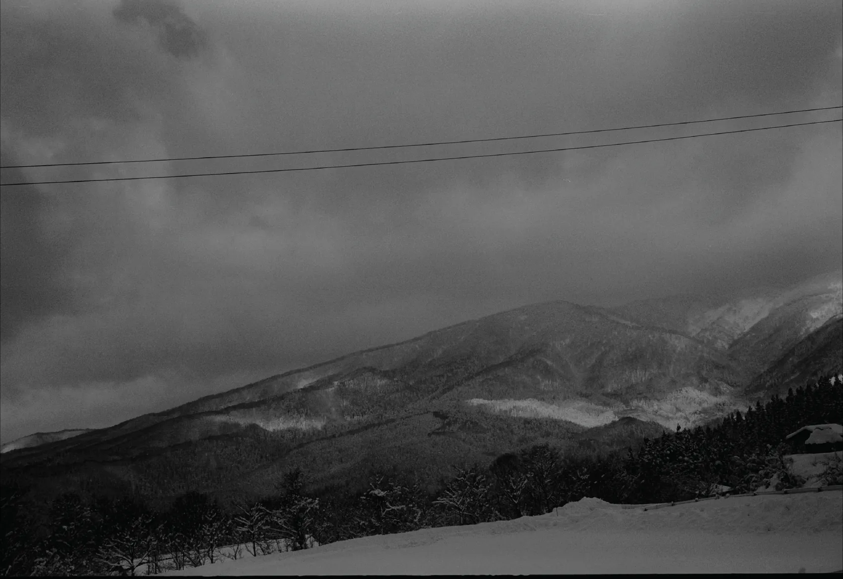
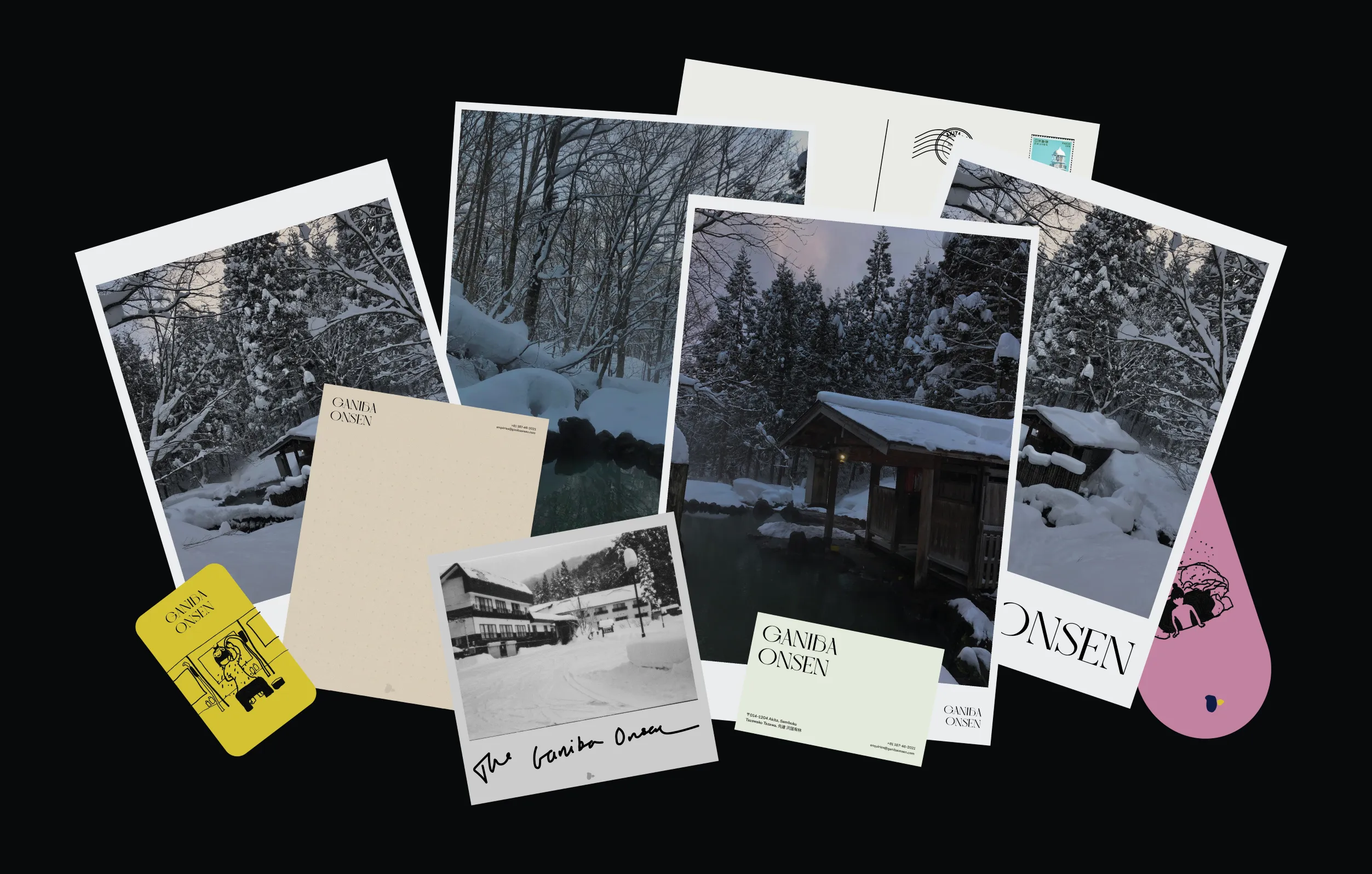
As a remote resort accommodation, I wanted promotional material to imitate the process of writing and sending pictures to friends and family. I created various mediums such as polaroids and postcards to help share the feeling I had of wishing people could experience the breathtaking silence and winter beauty.
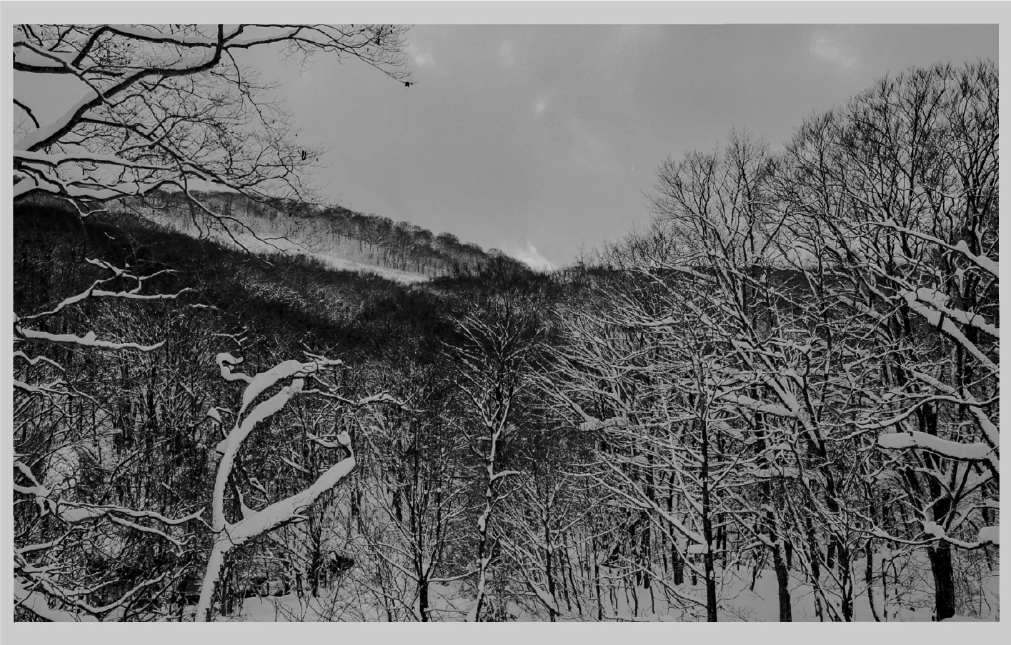
4c
Postcard - Front
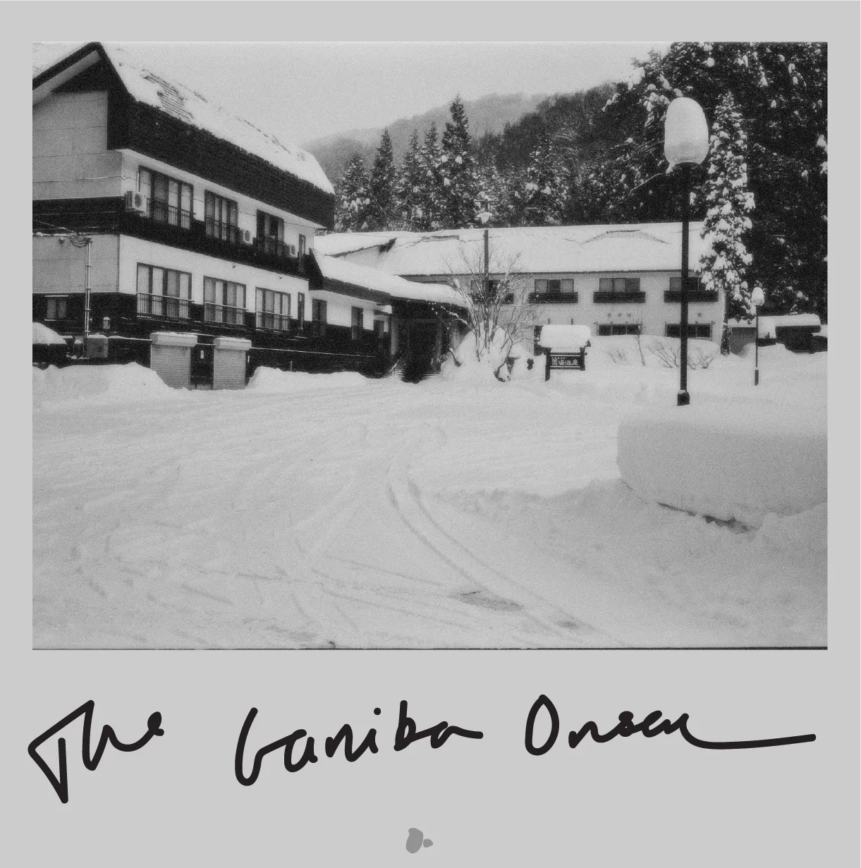
4a
Polaroid 01: "The Ganiba Onsen"
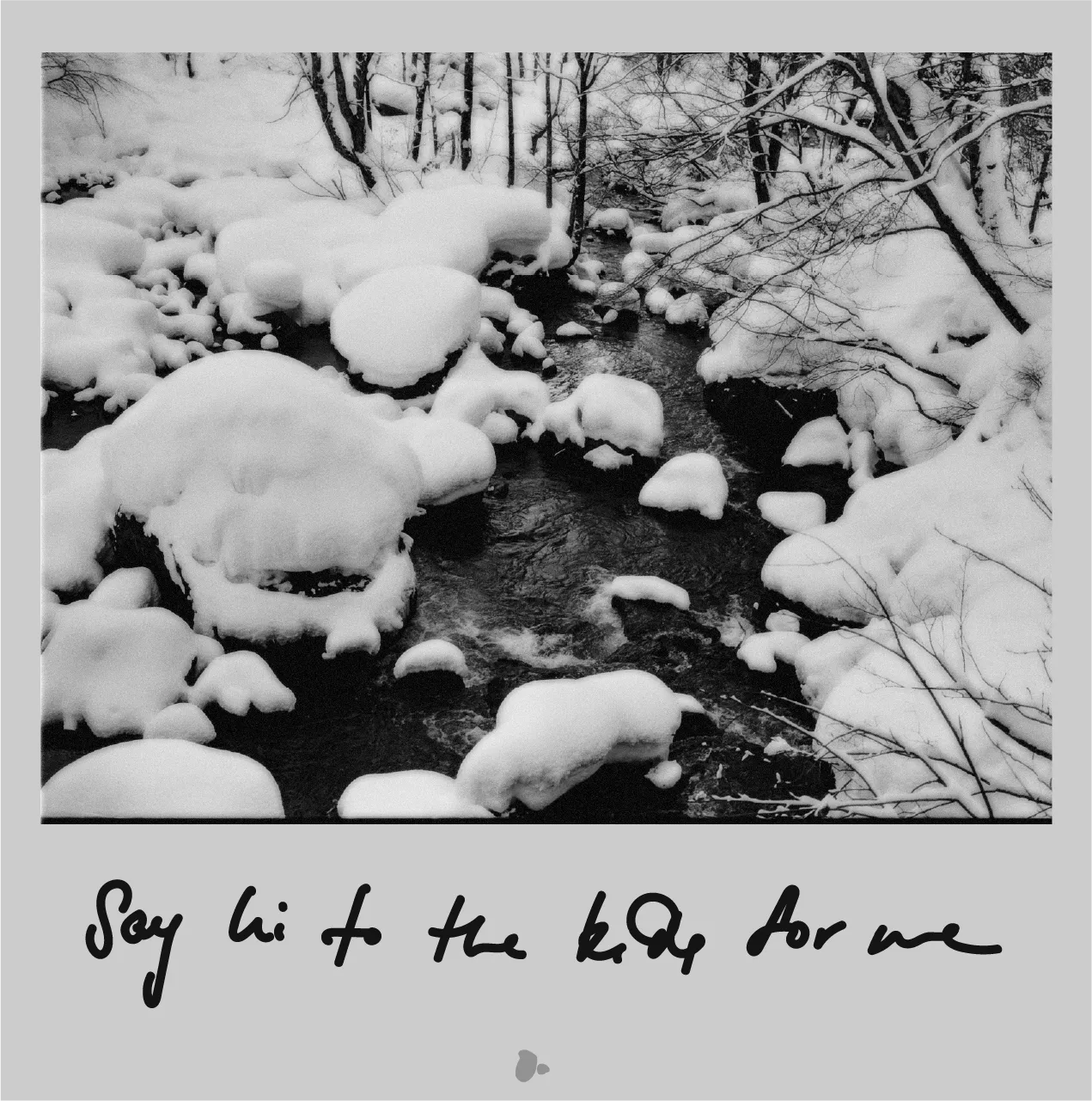
4b
Polaroid 01: "Say Hi To The Kids For Me"
My intention for the Onsen's posters was to hone in on the outdoor onsen and its seclusion from the outside world yet openness towards its surroundings.
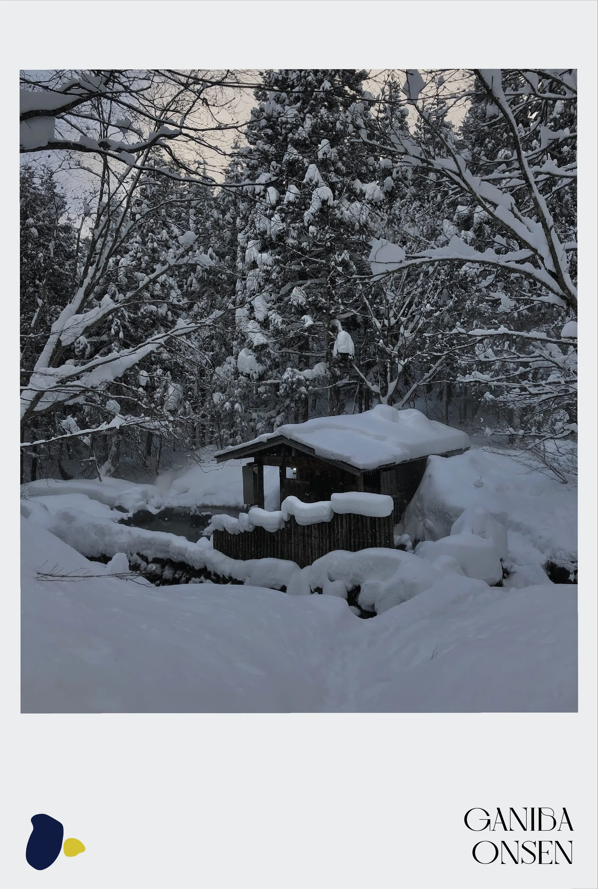
4e
Poster 1
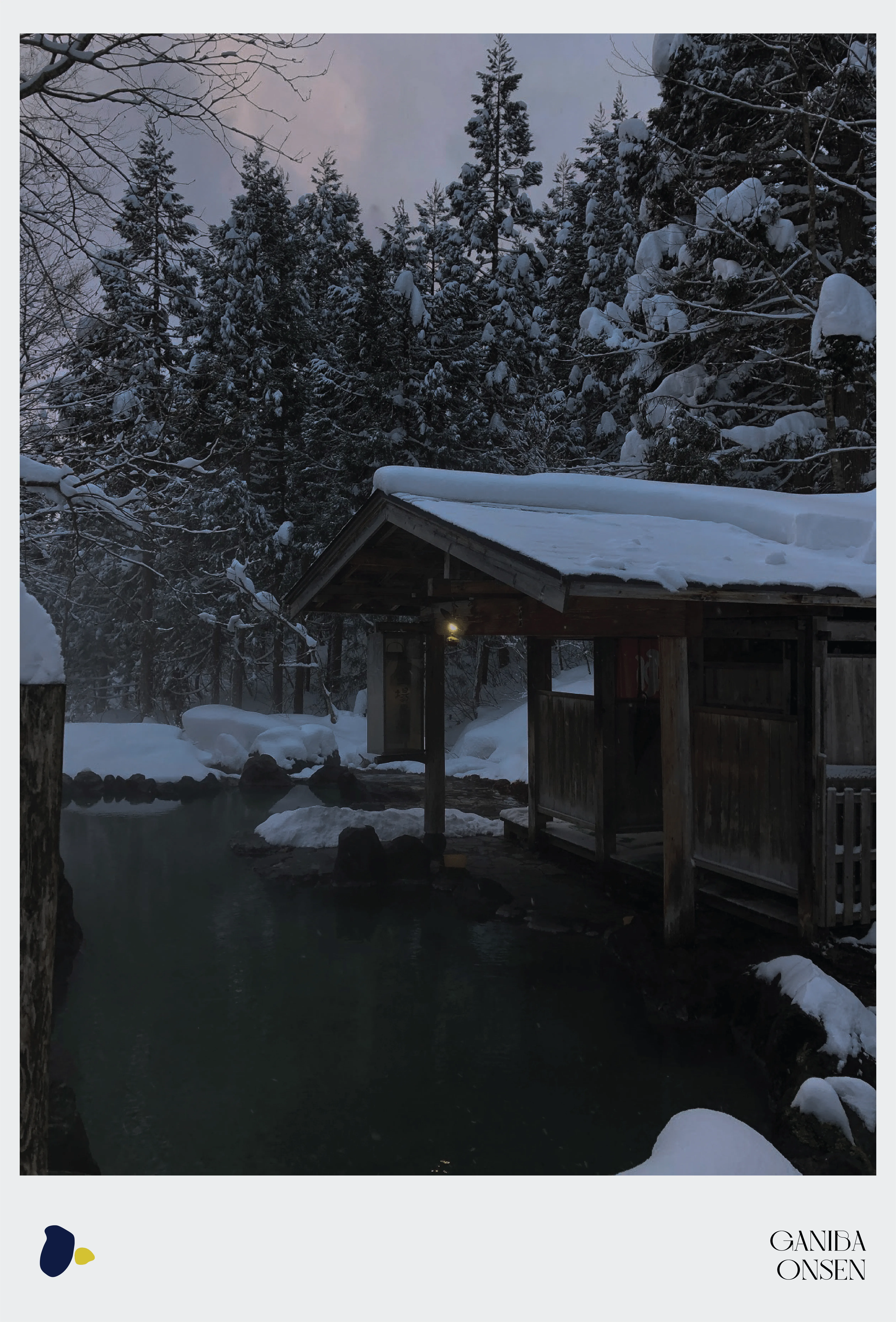
4f
Poster 2
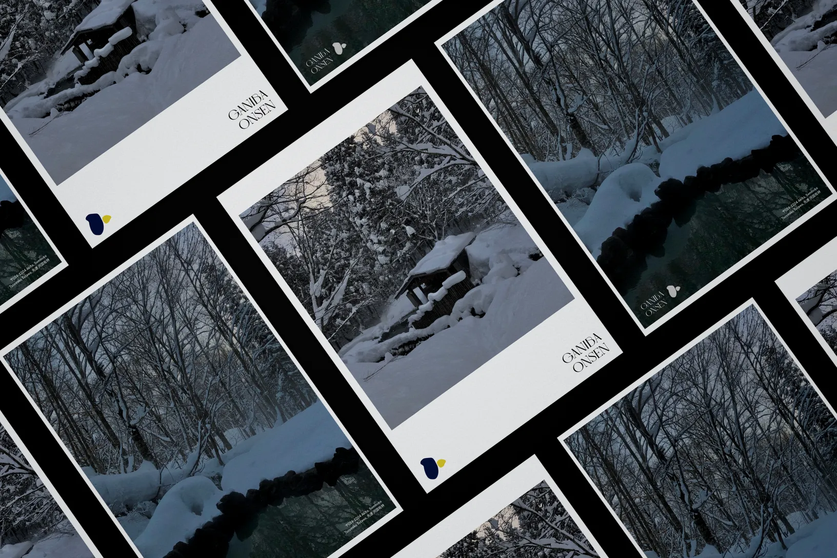
4g
Posters
